Caslon
By William Caslon, Invented in 1722
For this historically impactful typeface I will be creating a type specimen poster that explores its unique visual quality. In turn, I will gain a better understanding of the font and its historical significance.
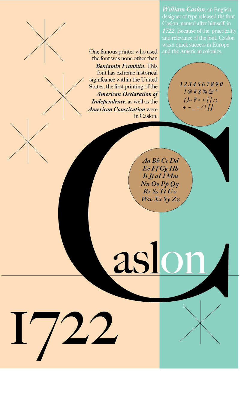
William Caslon, an English designer of type released the font Caslon, named after himself, in 1722. The design was based on 17th-century designs, which were very popular in England at the time. Because of the practicality and relevance of the font, Caslon was a quick success.
This typeface became well-traveled, being used all over Europe and the American colonies. One famous printer who used the font was none other than Benjamin Franklin. This font has extreme historical significance within the United States - the first printing of the American Declaration of Independence, as well as the American Constitution were in Caslon.

I very much enjoy the way this font looks - the old Dutch style that was referenced in the making of this font is reminiscent in every letter. I really like how each letter has a little line that comes out at the points, which I will attach a photo highlighting. I particularly like the jagged edges of the letter Z, couples with how narrow the top and bottom are, in contrast with the thick center line. This font looks very professional and legible. I also very much love the extension of the letter Q, this gives the font some personality that I have not seen in other typefaces.

Concept


Breadth


Depth

Between my breadth and depth for this poster, I started by removing the line between the two major colors, instead letting the colors themselves block the space off. I then added some padding to the text, and enlarged it slightly. I also removed some of the text so it wasn't too wordy. For the character list, I changed the color to something I felt matched the scheme better, and enlarged it + moved it higher up on the poster.

For my second depth iteration, I started by changing the background color to what I believed resembled parchment's color, which the American constitution, which used Caslon, would have been written on. The most apparent change was resizing the "S" to fill much more of the screen, and remove unnecessary negative space. I also enlarged the letters of Caslon as well. I then broke up the text, and enlarged it for spacing, readability, and centering next to the "S," and moved my character chart to the top left to fill that empty space.

Between my breadth and depth here, I enlarged my letter "G" to fill more of the page and flow better into my bottom text box. I also added the year of creation, 1722, to fill some of the empty space within the letter. I then split my history text into two columns for readability, and enlarged my character list. I also made my "Caslon" text much larger so that it was easily visible when looking at the poster.
Critique Based Iteration

Starting from the left - I was told that one thing I could try to represent through my type specimen poster was the red, white, and blue of the American flag, as well as the 13 stars of the colonies. I implemented this by changing the colors present, and using the star tool to add the stars in the bottom left.
I was encouraged to remove hyphenation in my poster text, and this was done in all 3 of my critique based iterations. I also was told that in my depth iterations, the word "Caslon" was too spaced out, appearing as "C," "asl," and "on." I brought them all closer together in all 3 iterations. I was told there was some empty space in general in my poster, so I added a fourth star to all and implemented a second circle with Caslon text, in this case the numbers in this font. One final thing I implemented in all 3 based off peer critique was emboldened text, which I used to emphasize important information in my text.
In my middle poster, I tried to reflect some peer instructions - I was told it may work better to make my "C" larger, which I then did and repositioned it to create some more contrast. I Also was told that my bottom left box could be filled more, so I then enlarged my "1722."
On my far right iteration, I tried to reflect my red, white, and blue recommendation in a different manner. In addition, I was also told my text could use more padding, so I tried to space it off of the color block better.
Finished Product